
GGplot2 is a powerful data visualization package in R, renowned for its flexibility and elegance in creating complex graphics. Built on the grammar of graphics, it allows users to construct visualizations by layering components, with geoms (geometric objects) serving as the core building blocks that define how data is represented visually. This article explores the concept of geoms in GGplot2, detailing their role, types, customization options, and practical applications. By understanding geoms, users can unlock the full potential of GGplot2 to create insightful and aesthetically pleasing visualizations tailored to their data analysis needs.
The grammar of graphics, the foundation of GGplot2, provides a systematic approach to plotting by breaking down visualizations into components like data, aesthetics, geoms, and scales. Geoms, in particular, are critical as they translate data into visual forms such as points, lines, or bars. This article will guide readers through the intricacies of geoms, offering a comprehensive understanding of their functionality, how they interact with other GGplot2 components, and their practical implementation in real-world data visualization tasks.
Understanding the Grammar of Graphics
The Role of Geoms in GGplot2
In GGplot2, geoms are the visual representations of data points, such as scatter plots, bar charts, or histograms. They are the elements that determine how data is displayed on a plot. Each geom is associated with a specific type of visualization, allowing users to choose the most appropriate representation for their data. For instance, geom_point() creates scatter plots, while geom_bar() generates bar charts. Geoms take data mapped through aesthetics (e.g., x, y coordinates, color, or size) and render them into graphical forms, making them essential for translating raw data into meaningful visuals.
How Geoms Fit into the Grammar of Graphics
The grammar of graphics, as conceptualized by Leland Wilkinson and implemented in GGplot2 by Hadley Wickham, decomposes a plot into layers comprising data, aesthetics, geoms, statistics, scales, coordinates, and facets. Geoms act as the layer that defines the visual form of the data, working in tandem with aesthetics to map variables to visual properties like position or color. For example, in a scatter plot, the geom_point() function uses x and y aesthetics to position points, while additional aesthetics like color or size can represent other variables, enabling multidimensional data representation.
The Relationship Between Geoms and Aesthetics
Aesthetics in GGplot2 define how data variables are mapped to visual attributes, such as position, color, shape, or size. Geoms rely on these mappings to render the plot. For instance, in ggplot(data, aes(x = var1, y = var2)) + geom_point(), the geom_point() function uses the x and y aesthetics to place points on the plot. Some geoms require specific aesthetics (e.g., geom_line() needs x and y), while others allow optional aesthetics for customization, such as color or fill, enhancing the flexibility of visualizations.
Types of Geoms in GGplot2
Basic Geoms for Simple Visualizations
GGplot2 offers a wide range of geoms to suit various visualization needs. Basic geoms include geom_point() for scatter plots, geom_line() for line graphs, and geom_bar() for bar charts. These geoms are ideal for straightforward data representations. For example, geom_point() is used to plot individual data points, making it suitable for exploring relationships between two continuous variables. Similarly, geom_bar() is effective for categorical data, displaying counts or summarized values as bars, providing a clear visual summary of frequency or magnitude.
Statistical Geoms for Summarized Data
Statistical geoms, such as geom_histogram(), geom_boxplot(), and geom_density(), are designed to visualize summarized or aggregated data. geom_histogram() creates histograms to show the distribution of a single variable, while geom_boxplot() displays the spread and outliers of a dataset through quartiles. geom_density() plots smoothed density curves, useful for understanding the distribution of continuous data. These geoms automatically compute statistics, such as counts or density estimates, simplifying the process of visualizing complex data patterns.
Specialized Geoms for Advanced Visualizations
GGplot2 also provides specialized geoms for more complex visualizations. For instance, geom_tile() creates heatmaps, geom_polygon() draws filled polygons for maps or custom shapes, and geom_smooth() adds smoothed trend lines, such as regression lines, to scatter plots. These geoms cater to specific use cases, like spatial data analysis or trend visualization, and allow users to create sophisticated graphics. For example, geom_smooth() can overlay a regression line on a scatter plot to highlight trends, enhancing interpretability.
Customizing Geoms in GGplot2
Modifying Geom Aesthetics
Geoms can be customized through aesthetics to enhance visual clarity or highlight specific data aspects. Aesthetics like color, fill, size, shape, and alpha (transparency) can be mapped to data variables or set to constant values. For example, in geom_point(aes(color = category)), points are colored based on a categorical variable, making it easier to distinguish groups. Alternatively, setting geom_point(color = “blue”) applies a uniform color to all points, useful for emphasizing a single dataset.
Adjusting Geom Parameters
Beyond aesthetics, geoms have parameters that control their appearance or behavior. For instance, geom_line() has a linetype parameter to specify solid, dashed, or dotted lines, while geom_bar() allows a stat parameter to switch between counting (stat = “count”) or using pre-summarized data (stat = “identity”). These parameters offer fine-grained control over the visualization, enabling users to tailor geoms to specific analytical goals, such as emphasizing trends or comparing categories.
Combining Multiple Geoms
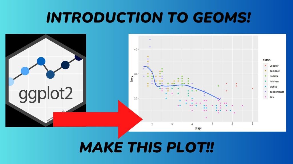
One of GGplot2’s strengths is the ability to layer multiple geoms in a single plot. For example, combining geom_point() and geom_smooth() creates a scatter plot with a trend line, providing both raw data and a summary of its trend. Layering is achieved by adding geoms sequentially in the GGplot2 call, such as ggplot(data, aes(x, y)) + geom_point() + geom_smooth(). This approach allows users to build complex visualizations that convey multiple data aspects simultaneously, enhancing interpretability.
Practical Applications of Geoms
Visualizing Relationships with Scatter Plots
Scatter plots, created with geom_point(), are widely used to explore relationships between two continuous variables. For example, plotting sales versus advertising spend can reveal whether increased spending correlates with higher sales. By adding aesthetics like color or size, users can incorporate additional variables, such as product category or region, to uncover multidimensional patterns. Scatter plots are versatile and serve as a foundation for many GGplot2 visualizations, especially when combined with other geoms like geom_smooth().
Summarizing Data with Bar Charts and Histograms
Bar charts (geom_bar()) and histograms (geom_histogram()) are effective for summarizing categorical and continuous data, respectively. Bar charts are ideal for comparing quantities across categories, such as sales by region, while histograms reveal the distribution of a variable, like customer ages. These geoms are particularly useful in exploratory data analysis, helping analysts identify trends, outliers, or clusters in the data, which can inform further statistical modeling or decision-making.
Advanced Visualizations for Specialized Data
Specialized geoms enable advanced visualizations for complex datasets. For instance, geom_tile() is used in heatmaps to display matrix-like data, such as correlation matrices, where color intensity represents values. Similarly, geom_map() facilitates geographic visualizations by mapping data to spatial polygons, useful for applications like election results or population density. These geoms allow users to tackle niche visualization challenges, making GGplot2 a versatile tool for diverse domains.
Best Practices for Using Geoms
Choosing the Right Geom
Selecting the appropriate geom depends on the data type and analytical goal. For continuous data, geom_point() or geom_line() is suitable for showing relationships or trends, while geom_histogram() or geom_boxplot() is better for distributions. Categorical data often pairs well with geom_bar() or geom_col(). Understanding the data’s structure and the story it aims to tell is crucial for choosing a geom that effectively communicates insights without misrepresenting the underlying information.
Balancing Complexity and Clarity
While GGplot2 allows layering multiple geoms, overcomplicating a plot can obscure insights. Best practices include limiting the number of geoms to maintain clarity, using consistent color schemes, and ensuring aesthetics enhance rather than overwhelm the visualization. For example, combining geom_point() with geom_smooth() is effective, but adding too many trend lines or annotations can confuse viewers. Testing and refining plots ensures they remain interpretable and visually appealing.
Leveraging Documentation and Community Resources
GGplot2’s extensive documentation and active community provide valuable resources for mastering geoms. The official GGplot2 website and R help files detail each geom’s parameters and aesthetics, while community forums and tutorials offer practical examples. Experimenting with different geoms and consulting these resources can help users overcome challenges and discover creative ways to visualize data, ensuring effective use of GGplot2’s capabilities.
Conclusion
GGplot2 is a cornerstone of data visualization in R, and geoms are its fundamental components, translating data into visual forms like points, lines, or bars. From basic geoms like geom_point() for scatter plots to specialized ones like geom_tile() for heatmaps, GGplot2 offers a versatile toolkit for creating tailored visualizations. By understanding geoms’ roles, types, and customization options, users can craft insightful graphics that reveal data patterns effectively.
The flexibility of geoms, combined with GGplot2’s grammar of graphics, allows users to build complex visualizations by layering multiple elements. Whether summarizing data with histograms, exploring relationships with scatter plots, or creating advanced heatmaps, geoms provide the tools to meet diverse analytical needs. Mastering geoms empowers users to communicate data-driven insights clearly and aesthetically.